
How to Choose a Pendant Light Color That Works with Your Existing Room
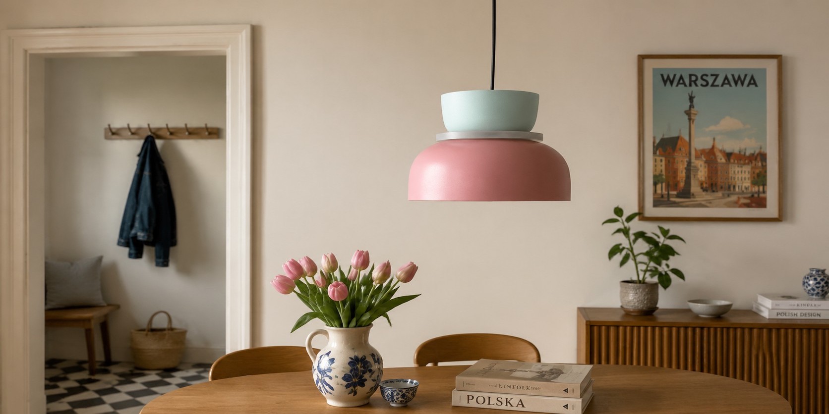
Choose pendant colour against the finishes you cannot easily change: wall, floor, table, worktop, and major upholstery. Then decide whether the light should repeat a small accent or stay quieter than the room. Do not start with a trend palette or the product thumbnail.
Make a Short List of Fixed Surfaces
Walk into the room and name the colours that will remain after the next cushion or vase is gone. In many European apartments, that list is shorter than it appears: plaster wall, oak or laminate floor, dining table, kitchen fronts, window frame, and sofa. These fixed surfaces set the boundary for a pendant.
Once those fixed surfaces are listed, compare them with the MACRI colour combinations. Eliminate options that repeat too many strong tones, then carry the remaining variants forward to the daylight and table-height tests.
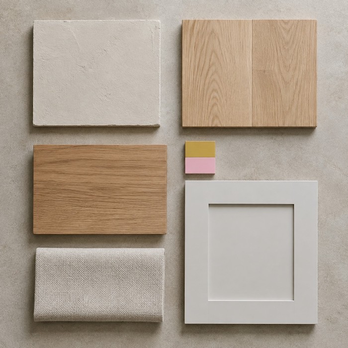
Photograph them in daylight and note whether they read warm, cool, light, dark, muted, or high contrast. You do not need to identify exact paint codes. You need to see which colours already carry visual weight.
If the fixed surfaces agree by day but the pendant changes after sunset, diagnose the lighting conditions with Why Your Pendant Light Color Looks Wrong at Night and How to Fix It before choosing another colour.
Choose One of Three Colour Roles
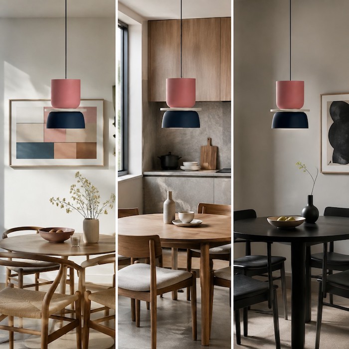
A pendant can repeat, bridge, or interrupt. Repeating means picking up an existing small colour from artwork or textiles. Bridging means connecting two fixed tones, such as light timber and a grey kitchen. Interrupting means using a deliberate contrasting colour in an otherwise quiet room. The third option is powerful but needs more empty visual space around it.
The MACRI listing offers multiple two-colour variants, so choose the relationship between the colours rather than treating every option as interchangeable. Its listed sizes also change how much colour appears in the room.
Test Colour at Table Height
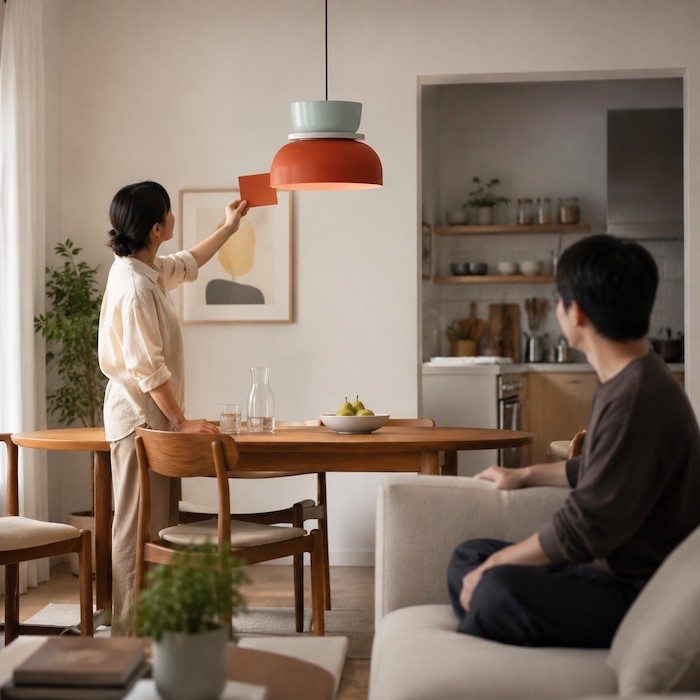
Hold a colour sample, fabric, or even a simple digital reference near the planned pendant location. View it from where people eat, from the sofa, and from the kitchen. The colour that works from the doorway can dominate the table; the colour that looks quiet at the table may disappear from the adjoining room.
Let the Ceiling Height Set the Visual Volume
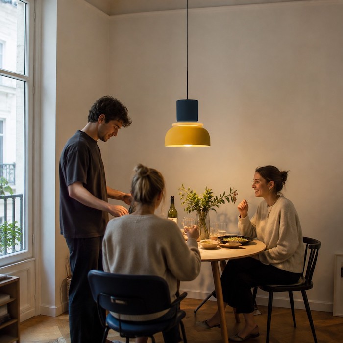
In a low-ceiling dining corner, a strong coloured pendant occupies more of the view than it does in a tall room. Choose a smaller or quieter variant when the fixture sits close to eye level across an open-plan space. Use a more expressive pairing when the rest of the room is settled, neutral, and gives the pendant room to breathe.
Before finalising the palette, compare how forgiving each colour family is in Pastel Pendant Lights vs Bright Primary Colors: Which Is Easier to Live With?, especially if textiles and artwork change often.
Order With Evidence, Not Hope
Save the selected variant, dimensions, wall and table measurements, and a daylight photo of the room. The MACRI page notes that colour differences and measurement discrepancies can occur, so this record helps you check the delivered item before installation. If goods are faulty or not as advertised, that is different from simply changing your mind about a colour; the EU legal-guarantee guidance explains the consumer-protection distinction.
When one relationship works from the table, sofa and kitchen, verify the selected variant and size on the current MACRI product page. Keep that record with the room photos, then order the version that passed both the fixed-surface and evening checks.
Questions for Choosing From What You Already Own
Should the pendant match the dining chairs?
Not exactly. It can repeat one small element, but matching every surface makes the room feel over-planned. Look for a relationship rather than a duplicate.
What if my floor and kitchen have different undertones?
Use a bridging colour with lower contrast, or choose a neutral component that lets both materials remain visible. Avoid using the pendant to force two fixed finishes to match.
Can a colourful pendant work in a rented flat?
Yes, when it responds to movable textiles and furniture rather than a wall you cannot repaint. Keep the surrounding palette flexible so the pendant can move with you.
What should I inspect when the lamp arrives?
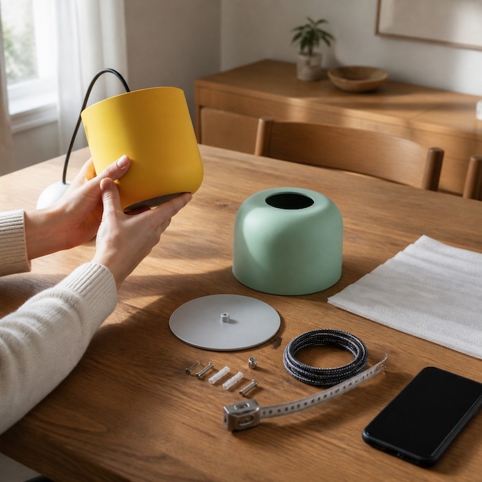
Confirm the selected colour variant, size, finish, shade condition, included hardware, and any visible damage before installation. Keep order and delivery records until the fitting has been checked.


