
Pastel Pendant Lights vs Bright Primary Colors: Which Is Easier to Live With?
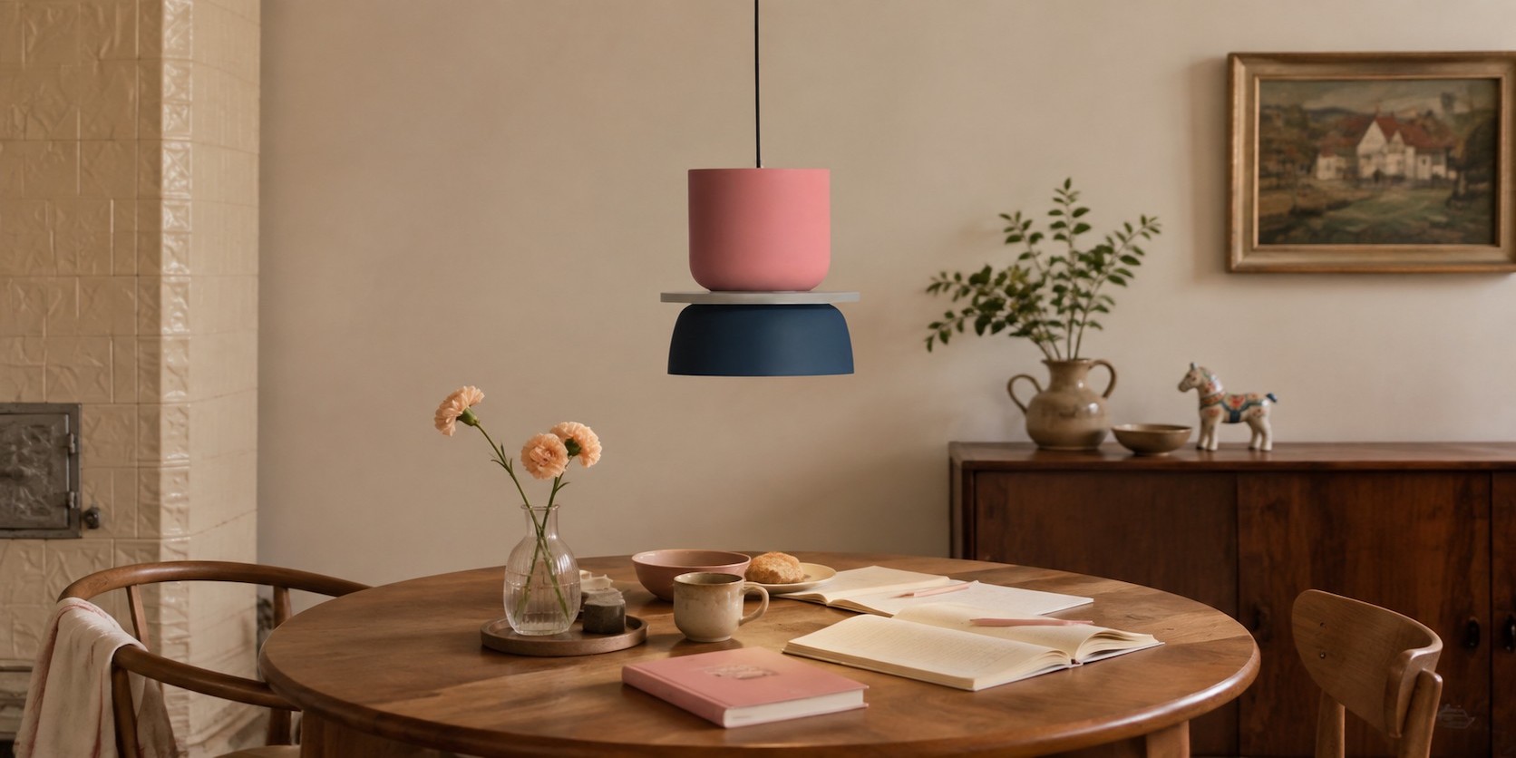
Pastels are usually easier to live with when the room changes often or already contains several materials. Bright primary colours work when the pendant is meant to be a clear anchor and the rest of the space can stay visually quiet. Neither is more timeless by default; the commitment level is different.
Think in Terms of Visual Commitment
A pastel pendant has lower contrast with pale walls, timber, linen, and everyday objects. It can become part of the room's atmosphere without demanding that every future cushion or artwork match it. That makes it useful in family dining rooms, rentals, or interiors that change with the seasons.
After deciding how much visual commitment the room can carry, compare the shortlist with the MACRI colour and size options. Treat colour area and fixture scale as one decision, because a vivid small accent behaves differently from the same palette overhead at a larger size.
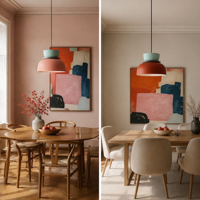
Bright primary colour creates a stronger visual statement. It can define a dining zone in an open-plan apartment or give a quiet room a memorable centre. It also asks more of the surrounding space: clutter, patterned rugs, colourful cabinets, and bold artwork can all compete with it.
To judge either palette against the room you already own, apply the fixed-finish method in How to Choose a Pendant Light Color That Works with Your Existing Room before relying on a trend image.
Compare the Recovery Cost of a Room Change
| When the room changes... | Pastel pairing | Bright primary pairing |
|---|---|---|
| New artwork appears | Usually absorbs it easily. | Needs a deliberate relationship. |
| Textiles change seasonally | Offers more flexibility. | Works best with a stable supporting palette. |
| The pendant moves rooms | Often easier to re-place. | May need a calmer new context. |
| The room needs a focal point | May be too quiet on its own. | Can define the zone immediately. |
Use Scale to Moderate Strong Colour
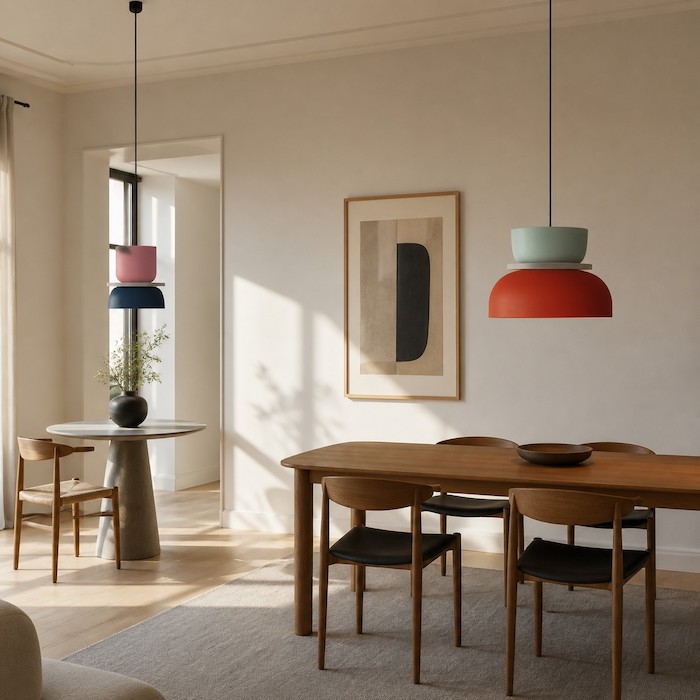
The MACRI listing includes three size options and several colour combinations. A vivid colour in the smallest suitable size can act as a contained accent; the same colour at a larger scale can become architectural. Choose the size from table and room proportions first, then decide how much colour you want the ceiling to carry.
Use the room and table proportions to shortlist a size, then verify the available colour combinations on the current MACRI product page. Treat the listing as a specification check, not a substitute for the daylight and evening colour tests.
Check the Evening Version of Each Palette
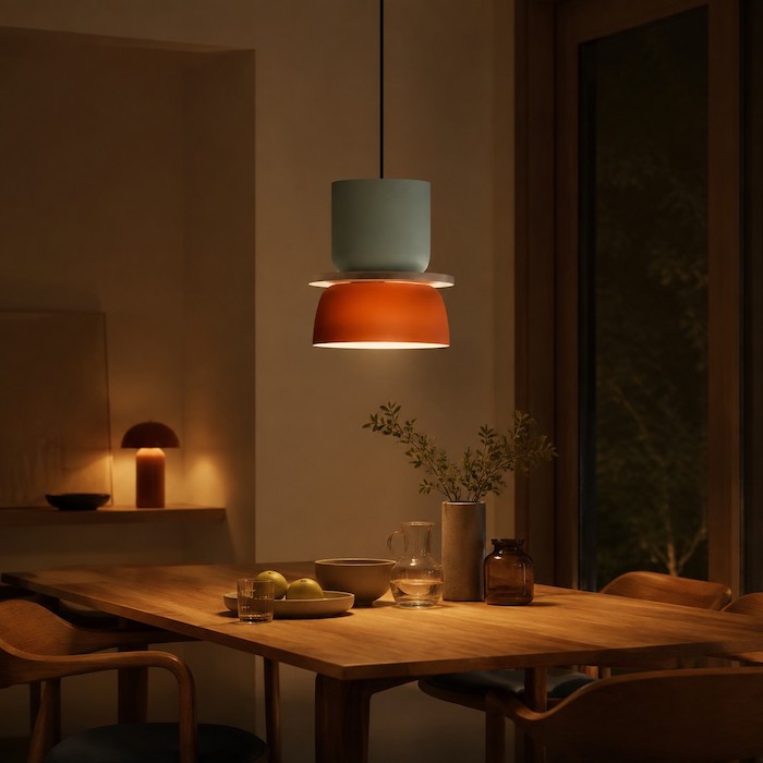
Pastel surfaces can become quieter under warm light, while saturated colours may look deeper or more dominant. Test the likely bulb and ambient layers at the hours when the table is actually used. If the pendant feels wrong only after dark, correct the bulb or competing light before abandoning the colour choice.
Choose the Option That Matches Your Household
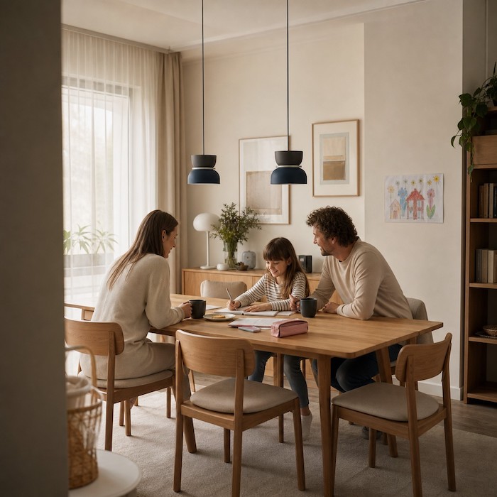
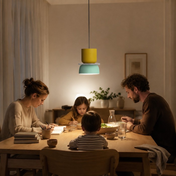
A room used for homework, meals, guests, and changing hobbies benefits from a forgiving palette. A quieter home with a settled table, pale walls, and little visual noise can support a bright colour-block pendant beautifully. The right answer is not what looks most exciting in a render; it is what still works when the table is covered with real life.
If one palette only becomes uncomfortable after dark, troubleshoot the bulb and reflected light with Why Your Pendant Light Color Looks Wrong at Night and How to Fix It before changing the pendant colour.
Keep the Delivery Decision Documented
Before fitting, check the selected MACRI colour combination, size, shade condition, and hardware against the order record. The product page notes possible colour and measurement differences. If a delivered item is faulty or not as advertised, that is different from a preference change; consult the retailer policy and, where relevant, EU guidance on legal guarantees.
Choose the palette only after checking it in daylight and at the hours when the room is used most. Record the selected size, colour combination, and fixed finishes so the delivery can be checked against the decision you actually made.
If the chosen palette remains comfortable through everyday clutter and evening light, confirm the exact combination on the current MACRI listing. Save the colour and size selection, then purchase the variant that passed the long-term room-change test.
Questions About Living With Colour
Are pastel pendants too subtle for a dining area?
Not when the room already has texture, timber, artwork, or daylight. They can create a coherent mood without competing with the table setting.
Do bright primary colours date quickly?
They can feel dated when every surface follows a short trend. A single strong pendant lasts better when it has a calm supporting palette and a clear role.
Which option is easier to move to a new home?
A lower-contrast pastel pairing usually asks less of the next room. A bright pairing can move well too, but it needs enough visual quiet around it.
Should I order a bold pendant without seeing it in person?
Use the listed dimensions, colour variant, and your room photos to reduce the risk. Inspect the delivered finish before installation and keep records until you know it is correct.


